

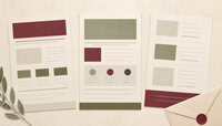

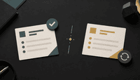

Newsletter formats determine how readers scan an email, understand its purpose, and decide what to do next. The right format depends on the audience, message, production capacity, and desired action. A plain editorial note may suit a founder update, while a structured digest may be better for recurring industry links or internal announcements.
There is no universal format that outperforms every other option. Choose a structure that can be produced consistently, tested across common email clients, and understood on a small screen. AI newsletter design tools can help implement a chosen structure, but they cannot decide which message serves the audience.
- Use one clear purpose for each issue.
- Place the most important message early.
- Keep layout, headings, and calls to action predictable.
- Test accessibility, mobile rendering, and link behavior before sending.
How to choose between newsletter formats
Start with the job the newsletter must perform. Is it helping the business build an email list, strengthening a direct relationship, summarizing useful resources, announcing products, sharing company priorities, or recognizing employees? Then consider how much original content the team can produce at the promised cadence.
| Format | Best use | Main design priority |
|---|---|---|
| Editorial letter | Perspective, leadership note, or focused explanation | Readable typography and a strong opening |
| Curated digest | Selected links, research, or industry developments | Clear grouping and useful commentary |
| Product or promotional | Launch, offer, event, or feature announcement | One primary value proposition and action |
| Roundup | Several updates from a defined period | Scannable sections and concise summaries |
| Internal update | Priorities, deadlines, recognition, and operational news | Ownership, dates, and action visibility |
Build a clear message hierarchy
The top of the email should answer three questions quickly: Who is this from? What is this issue about? Why should the reader continue? Use a specific subject line and useful preheader rather than a generic issue number.
Inside the message, lead with the primary point. Follow it with the evidence, explanation, or selected resources needed to support that point. Maintain visual consistency across headings, spacing, and calls to action. If the email requires an action, use a descriptive link or button that says what will happen next.
Plain text, HTML, and hybrid layouts
Plain-text-style messages can feel direct and personal. Rich HTML can support product imagery, stronger grouping, and branded design. A hybrid format uses mostly live text with light styling, clear spacing, and limited imagery.
The choice should follow the content. A personal note does not need a complex product grid. A retail launch may require images and structured product information. Regardless of format, send a valid text alternative and test the final message in the email clients used by the audience.
Practical format patterns
Editorial letter
Use one strong idea, a short introduction, several focused sections, and one closing action. This format works when the value comes from the author’s perspective or explanation.
Curated digest
Group links by theme and add original commentary that tells readers why each item matters. A list of unexplained links provides little differentiation. Keep the number of sections manageable.
Promotional announcement
State the offer or change clearly, explain who benefits, include important limitations near the claim, and provide one primary action. Avoid competing buttons that send the reader in several directions.
Internal team update
Separate information from action. Name owners and dates for required tasks. A useful structure may include leadership context, current priorities, decisions, deadlines, and recognition.
Design for mobile reading
A single-column structure is usually easier to scan on a phone. Use readable live text, generous spacing, descriptive headings, and controls that are easy to tap. Keep important information out of images because images may be blocked, slow to load, or difficult for assistive technology to interpret.
Check the email at several screen widths. Confirm that text does not require horizontal scrolling, links remain distinct, and buttons do not crowd one another.
Make the newsletter accessible
Accessibility improves the experience for everyone. Use semantic headings, meaningful link text, descriptive alternative text for useful images, sufficient color contrast, and a logical reading order. Do not communicate essential meaning through color alone.
The W3C overview of the Web Content Accessibility Guidelines provides a reliable foundation for accessible digital content. Email-client support varies, so combine standards-based design with real-client testing.
Use interactive content carefully
Polls, accordions, carousels, and other interactive blocks can reduce friction, but support differs across clients. Provide a usable fallback and never hide the essential message inside an unsupported interaction. Test the feature before relying on it.
Set a sustainable cadence
A predictable schedule builds reader expectations, but consistency should not force low-value issues. Choose a cadence the team can maintain during busy periods. Define an editorial owner, production deadline, approval step, and test checklist. Clear email marketing manager responsibilities help keep those decisions accountable.
Measure the format, not only the subject line
Open data can be affected by privacy features and automated image loading. Use a combination of measures such as clicks, replies, conversions, unsubscribes, complaints, and direct reader feedback. Select the measure that matches the newsletter’s purpose.
When testing a format, change one meaningful element at a time. For example, compare one primary action with several competing actions, or compare a short digest with a longer version. Keep the audience and sending conditions comparable.
Pre-send checklist
- Confirm the subject line, preheader, sender name, and reply address.
- Check every link and the destination after tracking is applied.
- Review spelling, dates, pricing, and required qualifications.
- Test desktop, mobile, dark mode, and image-blocked views where practical.
- Confirm headings, reading order, contrast, and alternative text.
- Send a test to someone who did not build the message.
Frequently asked questions
What is the best newsletter format?
The best format is the one that fits the audience’s need, supports the intended action, and can be produced reliably. Test it with actual readers rather than assuming one layout is universally superior.
How often should a newsletter be sent?
Choose a schedule that matches the value available and the team’s capacity. Weekly, fortnightly, or monthly can all work when expectations are clear and the content remains useful.
Should a business use plain text or HTML?
Use plain-text-style email for direct, personal communication and HTML when structure or imagery materially helps the message. A light hybrid layout is often a practical middle ground.
How many calls to action should an issue contain?
Use one primary action when the message has one main objective. A digest can contain several links, but each should have a clear label and the hierarchy should remain obvious.
How can newsletter accessibility be improved?
Use live text, semantic headings, descriptive links, useful alternative text, sufficient contrast, and a logical reading order. Test with images disabled and, where possible, with assistive technology.
Conclusion
Newsletter formats are strategic choices, not decorative templates. Define the message’s job, choose a structure that supports it, make the email readable and accessible, and test the result with real audience behavior. Consistent value and clear communication matter more than visual complexity.